
Usama Waheed
Have Daraz kept their promise?
Daraz is one of Asia’s largest e-commerce platforms. Can they sell us on their user experience?
Have Daraz kept their promise?
Daraz is one of Asia’s largest e-commerce platforms. Can they sell us on their user experience?
Usama Waheed
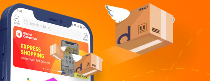
Daraz is aiming to be the Amazon of South Asia. Acquired by Alibaba in 2018, it’s making huge strides in the Pakistani e-commerce industry, with over 5 million monthly users as of March 2020.
Despite its success, there are plenty of UX problems with their site. Here's some of their worst offences.
? Tip: click the slides below to start. Use arrow keys to move around; or swipe if you're on a mobile device.
Full case study in slides above ?
Quick summary down below ?
The mobile experience is much better in fullscreen
Full case study in slides above ?
Quick summary down below ?
Key takeaways
Help users find what they need
Daraz sells a lot of stuff. This is generally a good thing, because you can be reasonably sure that you’ll find what you need on the site.
But when there’s too many options, people tend to have a hard time finding just the right product. Providing useful categories and filters helps ease this problem.
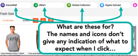
Here we see Daraz providing categorizations of some sort - but can you tell what DarazMall or Global Collections might be? It’s important to give some indication of what these sections are, otherwise users will ignore them. And to make things worse, there’s no explanation after you click through to these pages either.
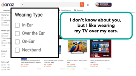
Nor are Daraz’s filtering options of much use. Here, I searched for a TV, but basic filters like brand or screen size are missing. This means that I’ll have to scroll through the entire list of results, or re-do my search - making it likely that I abandon the process altogether.
Provide alternatives
Commitment is hard. Do I really want that TV? Are there other options I could look at?
When users scroll down a product page, they’re generally looking for information to help them confirm that they’re making the right choice, or looking at what alternatives there might be.
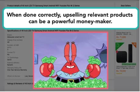
This is where the ‘related products’ algorithm kicks in. By providing choices in the same price range, or other options by the same manufacturer, you’re giving your users a few more items to consider that might just be the perfect choice. Or maybe there’s a useful add-on you can suggest that makes sense with my purchase.
Daraz has the technology, but doesn’t make good use of it. There are usually no related products or upsells at all, and when there are, they’re completely irrelevant or overdone.
Don’t ask for unnecessary investments
Daraz’s location selector takes you through a wild ride. It took me 39 (thirty-nine!) clicks to select my location, making me invest a lot of time in getting what was not very useful information.
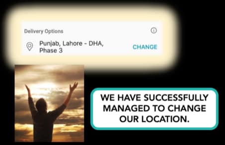
This isn’t a great experience by any measure, and maybe it’s necessary at the checkout phase when users enter their address.
But to have them do this on the product page is a terrible choice. The information I’m looking for is simple: how long will it take for the product to be delivered? I have to go down a rabbit hole of clicks and keystrokes to select my delivery area down to the exact neighborhood, but at the end of this entire journey, it still gives me a huge delivery range. They could probably have given me the exact same information by just asking for my city. One click, done.
This is neither useful nor necessary for the information people are looking for at this point, and in fact distracts from the main task on the product page - deciding whether to add it to cart or not.
Try it yourself and see how many clicks/taps/keystrokes it takes you to change your location; or better yet, ask an unsuspecting friend to do it.
Tweet your high score using #DarazLocationGame - highest score gets our deepest sympathies.
Want more? Follow us on Twitter, where we tweet about UX tidbits.
More case studies

Is Cheetay really “really really easy”?
Cheetay is a food delivery app - but can they also deliver a great user experience?

Part I: What’s it like to send Rs. 1000 in Pakistan?
Featuring Habib Bank, Faysal Bank and Dubai Islamic Bank

Part II: What’s it like to send Rs. 1000 in Pakistan?
Featuring Standard Chartered, Easypaisa and SimSim.
Want to work together?
Quick links
Want to work together?