
Usama Waheed
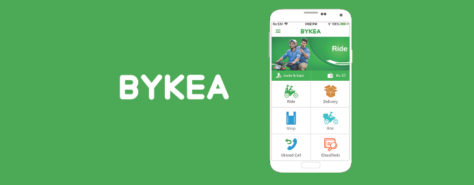
Can Bykea deliver good UX?
Bykea is a multi-purpose delivery app. But can they deliver an easy-to-use app as well?
Can Bykea deliver good UX?
Bykea is a multi-purpose delivery app. But can they deliver an easy-to-use app as well?
Usama Waheed
Bykea is a delivery app that revolves around…you guessed it, bikes.
They’ve done well to try and make the app accessible to novice technology users. But there are some critical flaws in the UX.
View the slide deck below, or scroll down for key takeaways.
? Tip: click the slides below to start. Use arrow keys to move around; or swipe if you're on a mobile device.
Full case study in slides above ?
Quick summary down below ?
The mobile experience is much better in fullscreen
Full case study in slides above ?
Quick summary down below ?
Key takeaways
No context, no party
While Bykea does actually work, it expects users to do the heavy lifting of understanding what it does.
There’s no onboarding, no introduction to features, no help text. No context at all.
Here's the delivery screen, which - if you haven't used the app before - struggles to convey what exactly you're supposed to do:
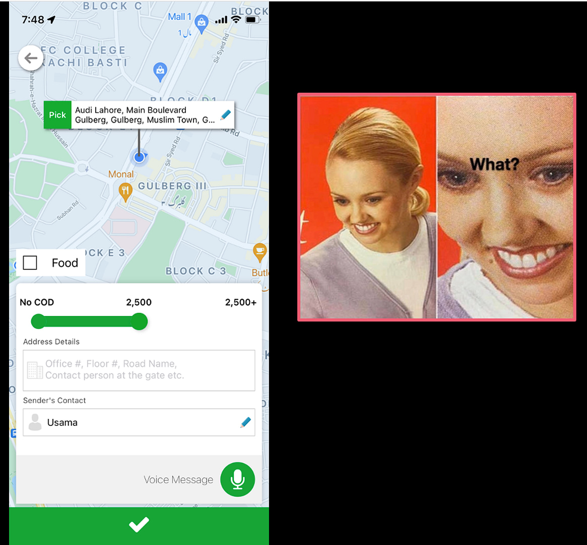
Each time you open a new feature, you have to work your way around it to figure out what it is.
And this discourages people from exploring the app in case they make a mistake – especially the novice users Bykea is trying to help.
No review screens
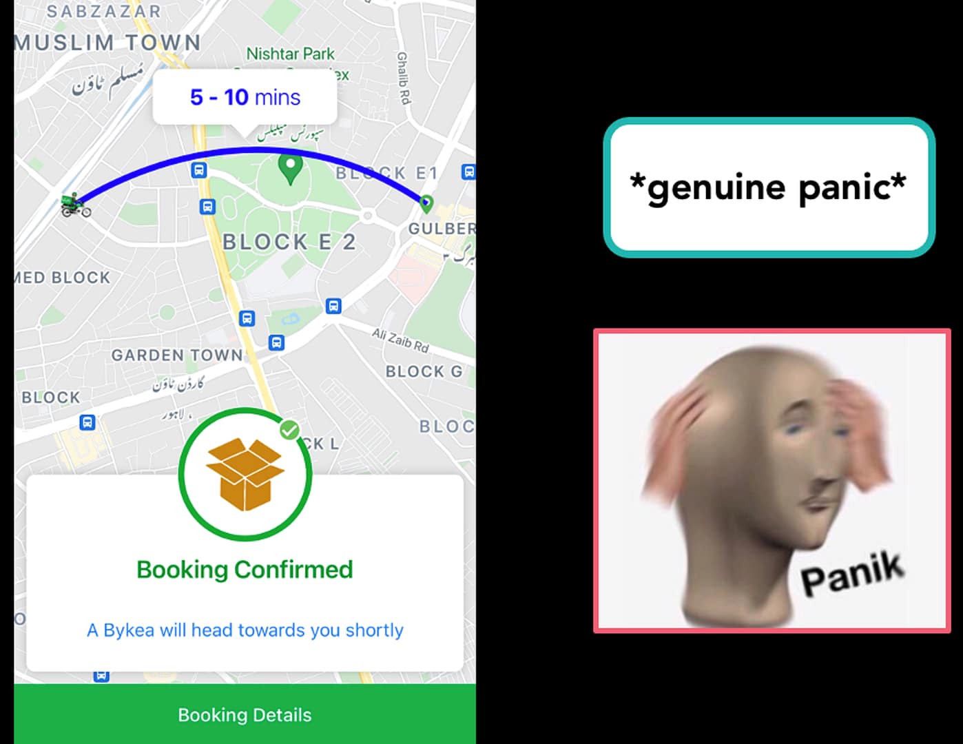
In more than one part of the app, you get served a big green checkmark to press.

This button actually places an order – with no warning. There’s no opportunity to review what you’re doing, and the tick mark doesn’t indicate its purpose.
This is why labelling buttons is critical: it tells users what to expect before they press it.
I legitimately did panic when it showed me that I had placed an order.
And I’m guessing Bykea gets plenty of cancellations because of this. Or worse still, some users may not know what’s happened and don’t cancel at all.
Accessbility
I do want to highlight Bykea’s efforts to make the app accessible to low-literacy users.
The colored cards and icons help with this, and the Android version of the app comes in Urdu. There’s even an Urdu typing feature, and voice notes to send riders who may not be able to read.
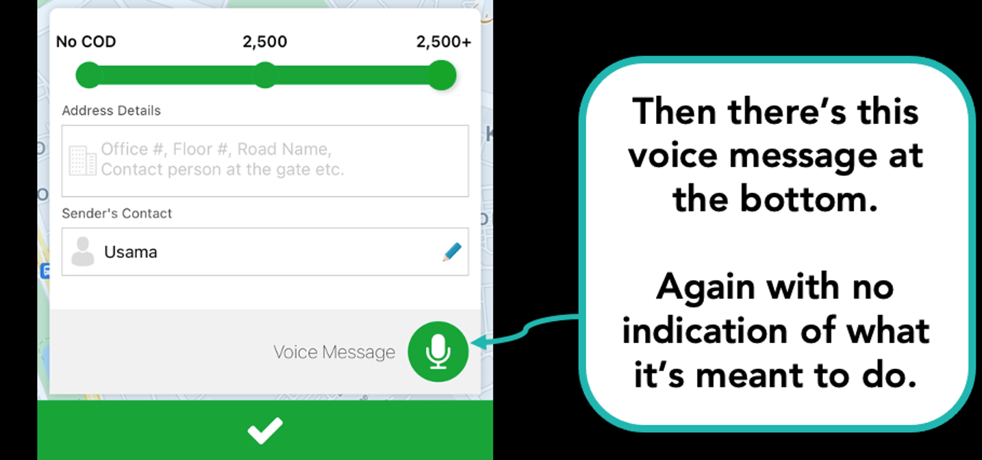
But again, it’s important to provide context to new users on how they can use these features.
Having to guess what something will do means many users won't bother using these features at all - which is a shame considering they're already implemented.
More case studies

Have Daraz kept their promise?
Daraz is one of Asia’s largest e-commerce platforms. Can they sell us on their user experience?

Part I: What’s it like to send Rs. 1000 in Pakistan?
Featuring Habib Bank, Faysal Bank and Dubai Islamic Bank

Part II: What’s it like to send Rs. 1000 in Pakistan?
Featuring Standard Chartered, Easypaisa and SimSim.
Want to work together?
Quick links
Want to work together?