Usama Waheed
Part I: What’s it like to send Rs. 1000 in Pakistan?
Featuring Habib Bank, Faysal Bank, and Dubai Islamic Bank.
Part I: What’s it like to send Rs. 1000 in Pakistan?
Featuring Habib Bank, Faysal Bank, and Dubai Islamic Bank.
Usama Waheed

This is the first of our 4-part case study on the state of e-banking in Pakistan. We take a look at how easy it is to send money using 12 different apps.
? Tip: click the slides below to start. Use arrow keys to move around; or swipe if you're on a mobile device.
Full case study in slides above ?
Quick summary down below ?
The mobile experience is much better in fullscreen
Full case study in slides above ?
Quick summary down below ?
Key takeaways
There are many, many problems to pick apart in e-banking. I’ll limit myself to one problem each for HBL, Faysal Bank, and Dubai Islamic Bank
Habib Bank
HBL’s app isn’t a particularly bad user experience (trust me, I’ve seen worse). But one missed trick is not giving users a sense of progress and instead adding to their cognitive load (resources being used by the brain).
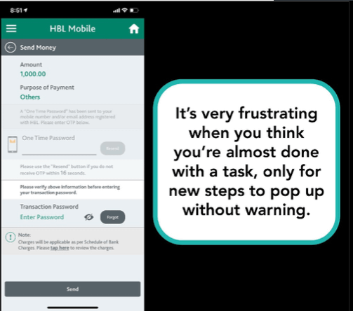
I completed three steps on this page: filled in account details, entered the one-time pin (OTP), and input my transaction password. But this is all on the same screen, making it increasingly cluttered.
And there’s no indication of how many steps there are or how close I am to completing my goal.
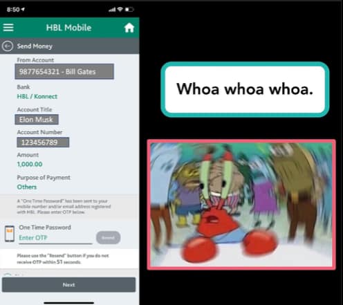
They also merge the ‘confirm account title’ step with ‘enter OTP’ step - giving you a 60 second countdown clock to do both tasks at the same time.
Faysal Bank
The FBL app suffers from a lack of navigational cues - how to move forward and backwards through a task.
First you have to dig into the menus to find the ‘transfer money’ option - it’s not on the home screen.
When you do find that menu, there’s a bunch of options to choose from, and none of them have a description to help you choose.
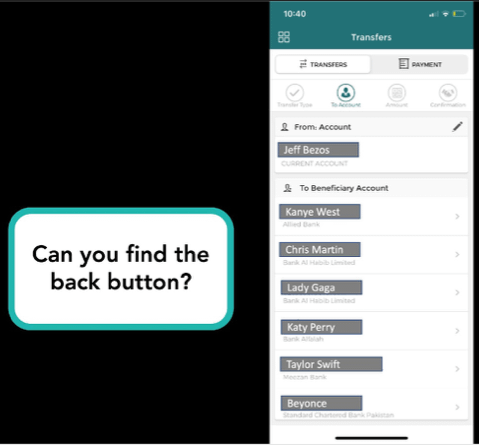
And finally, if you choose incorrectly, it’s near-impossible to figure out how to go back without starting over.
Dubai Islamic Bank
DIB’s app still gets updates, but they don’t seem to be meaningful. The app’s resolution is still from the iPhone 6 era.
It suffers from many of the same problems as Faysal Bank’s app, which is no surprise since it looks like they’ve been made by the same vendor.
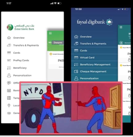
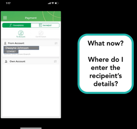
What makes it worse, though, is that there are zero instructions on how to do anything. Tapping on ‘Transfers and Payments’ leads to a dead end. You have to figure out on your own that first you need to go to different menu to add a beneficiary, then go back to ‘Transfers and Payments’, select the right list, and then find the newly-added account there.
I consider myself an advanced user, and genuinely struggled to figure this out; so what hope is there for a more typical user?
Want more? Follow us on Twitter, where we tweet about UX tidbits (sometimes).
More case studies
Want to work together?
Quick links
Want to work together?


