
Usama Waheed
Is Cheetay really "really really easy"?
Cheetay is a food delivery app - but can they also deliver a great user experience?
Is Cheetay really "really really easy"?
Cheetay is a food delivery app - but can they also deliver a great user experience??
Usama Waheed
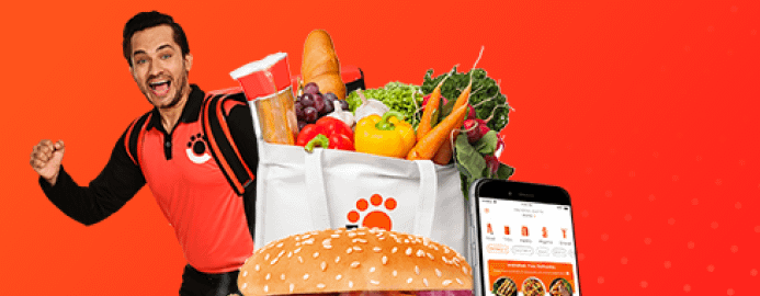
Cheetay is the only real challenger to Foodpanda in the Pakistani food delivery space. They do a lot of things right with their app, but there’s plenty they’ve gotten wrong as well.
? Tip: click the slides below to start. Use arrow keys to move around; or swipe if you're on a mobile device.
Full case study in slides above ?
Quick summary down below ?
The mobile experience is much better in fullscreen
Full case study in slides above ?
Quick summary down below ?
Key takeaways
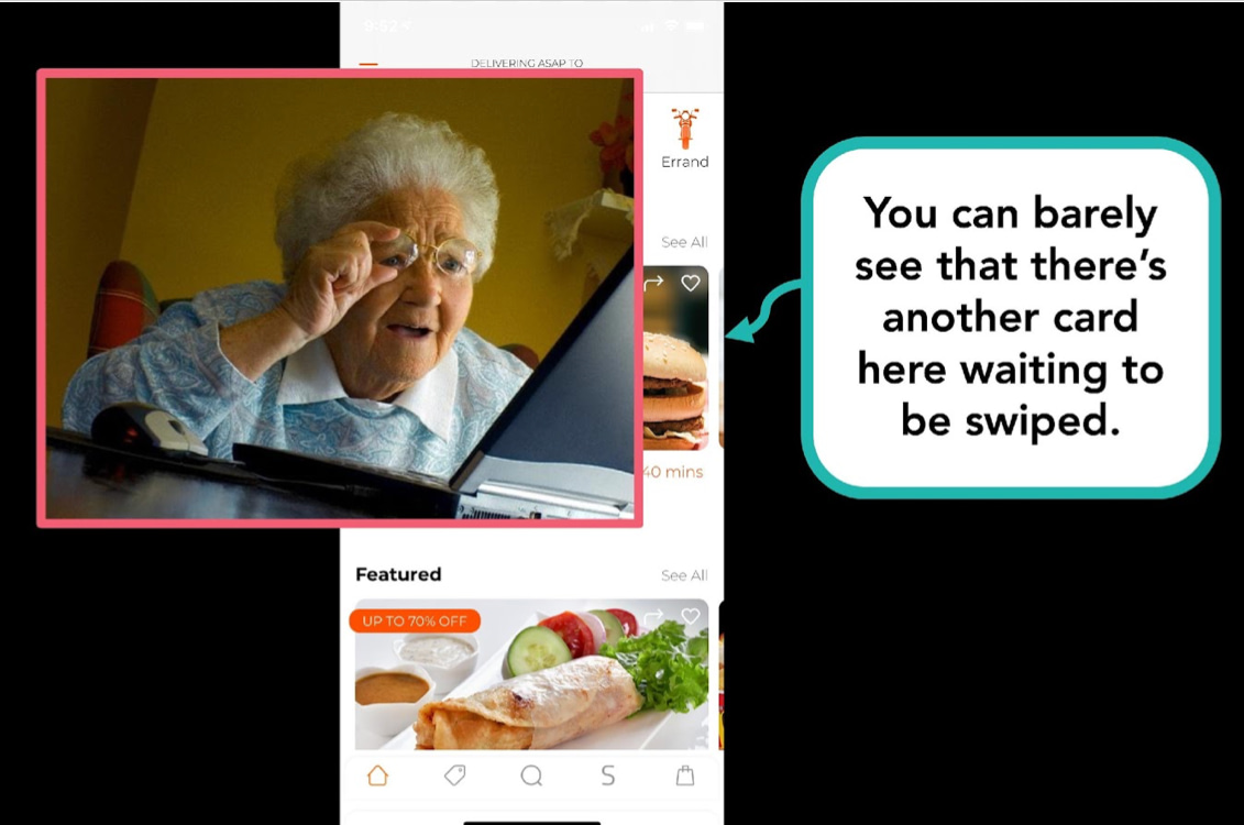
Make content easily discoverable
Cheetay’s horizontal cards are sized so that you can barely see them peeping out from the edge. And even if you do know it’s there, you’re less likely to swipe through because you can’t see what’s coming up.
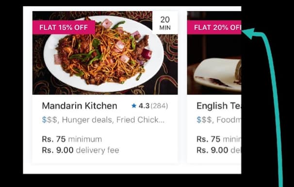
Compare this to Foodpanda’s cards, that show just about enough information to make you curious about what that big discount is or what that nice-looking photo is of.
The hardest part about ordering food is deciding what to eat, and swiping through more restaurants increases the likelihood that you find something you like. Which in turn increases the chances that you actually order. Which means more money for the app. This is a great example of how a tiny UX tweak can increase your revenues at zero additional cost.
Sell your features
Cheetay has a host of features that sound interesting, and may well help them compete against the likes of Foodpanda. But there’s no explanation of what they actually do, making the app a tough sell.
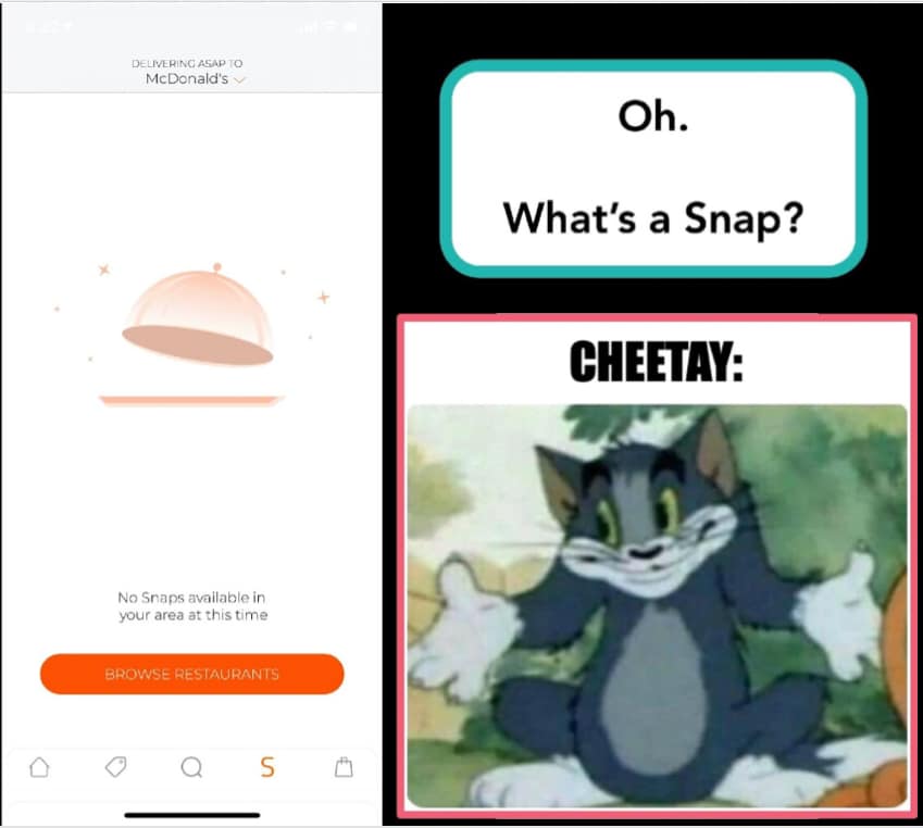
Here, they have an entire button in the navigation menu with a dedicated page for ‘Snaps’…but all it tells you is that it’s unavailable.
They repeat the same mistake with their Xoom subscription service: the icon doesn’t tell you what it is, nor does the actual subscription page do a good job of selling its benefits.
And there’s also a missed opportunity to upsell sides and add-ons during checkout.
Clearly show system status
Users should be able to tell at a glance what’s happening on the screen. The squint test is a useful way of determining you’re showing the right information with the right level of urgency.
Compare the two screens below:
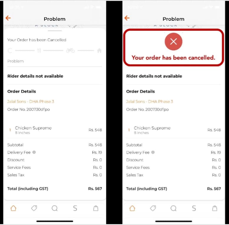
Which one can you look at for 1/10th of a second and immediately know that something is wrong? It’s important to highlight critical information immediately.
Want more? Follow us on Twitter, where we tweet about UX tidbits (sometimes).
More case studies

Have Daraz kept their promise?
Daraz is one of Asia’s largest e-commerce platforms. Can they sell us on their user experience?

Part I: What’s it like to send Rs. 1000 in Pakistan?
Featuring Habib Bank, Faysal Bank and Dubai Islamic Bank

Part II: What’s it like to send Rs. 1000 in Pakistan?
Featuring Standard Chartered, Easypaisa and SimSim.
Want to work together?
Quick links
Want to work together?