Usama Waheed
Part II: What’s it like to send Rs. 1000 in Pakistan?
Featuring Standard Chartered, Easypaisa, and SimSim.
Part II: What’s it like to send Rs. 1000 in Pakistan?
Featuring Standard Chartered, Easypaisa, and SimSim.
Usama Waheed

This is the second of our 4-part case study on the state of e-banking in Pakistan. We take a look at how easy it is to send money using 12 different apps.
? Tip: click the slides below to start. Use arrow keys to move around; or swipe if you're on a mobile device.
Full case study in slides above ?
Quick summary down below ?
The mobile experience is much better in fullscreen
Full case study in slides above ?
Quick summary down below ?
Key takeaways
I’m going to highlight one problem each with Standard Chartered, Easypaisa, and SimSim; but I recommend you go through the slide deck above, especially for Easypaisa. They’ve done a fantastic job.
Standard Chartered
SCB’s app looks like it hasn’t been updated in 10 years. It’s functional, yes, and that’s obviously important. But for a massive multinational bank, it’s not a great look: an outdated interface can reduce user confidence in your product.
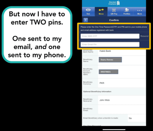
SCB’s biggest problem, though, is the number of steps needed to complete a payment. First, you have to figure out that ‘Move’ means sending money. Then you can only send money to accounts you add as a payee - which they don’t tell you about.
When you’ve figured that out, you have to input two separate pins: one sent to your phone, and one sent to your email. Most other apps give you the choice of one or the other.

Security is important, but this means you’re stuck if you’re ever without a cellphone signal or - and this isn’t entirely unlikely for older users - if you’ve forgotten your email password. And there are other scenarios where a cell signal isn’t easy to get: maybe you’re abroad; maybe you’re in a village; or maybe you’re just unfortunate enough to have a bedroom in the basement.
After all these steps, then you go back to actually send the money to the newly added payee. Certainly not a frictionless experience.
Easypaisa
I’ll be honest, I have no major complaints with Easypaisa. The general experience is really well-designed, and solves many of the UX problems that traditional banking apps have.
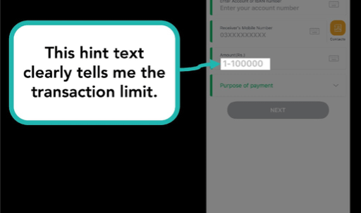
It also has plenty of little thoughtful touches such as mentioning the transaction limit.

I say thoughtful, but this is quite basic stuff that most other apps get wrong.
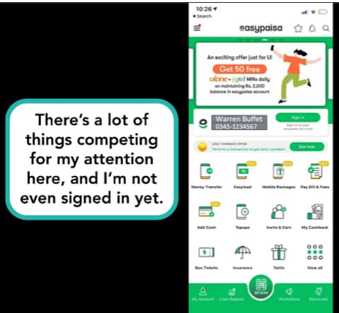
My only real gripe would be the extremely cluttered home screen that pushes every single feature available on one screen.

And to make things worse, there are moving banner ads at the top that add to the distraction. I understand the need to push metrics by making features discoverable, but I feel they've gone too far on the other end of the spectrum to make it overwhelming rather than accessible.
By comparison, JazzCash does their home screen really well (see for yourself in Part IV of this series!)
SimSim
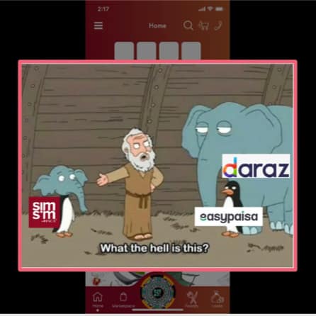
SimSim is better than many of the traditional banks, but comfortably the worst of the digital wallets.
It tries hard to be a banking app and an e-commerce app, and fails miserably at both.

The home screen is even more cluttered than Easypaisa, because the shopping section is thrown in there as well. And other parts of the app keep pushing the shopping features even when they’re not needed, such as the search and cart icons that are ever-present at the top.
It’s certainly functional, but compared to the competition (Easypaisa, JazzCash, HBL Konnect), it’s well behind for a digital wallet.
Want more? Follow us on Twitter, where we tweet about UX tidbits (sometimes).
More case studies
Want to work together?
Quick links
Want to work together?


