Muawin
Designing financial technology for low-literacy users
Expertise
Research, Design & Interaction
Deliverables
UX, UI & Protoype
Muawin is a micro-lending service that provides loans to small shops and corner stores.
But instead of giving cash loans, they collaborate with manufacturers to stock these stores, and they pay Muawin back for this inventory over the next few months.
How it started
Muawin approached us with what seemed like a relatively straightforward brief: translate their English app into Urdu to make it more accessible.
From subsequent discussions with their team, it became clear that a simple translation would not be enough.
Goals
The hope with translating the app was thus:
More people understand the language
↓
Improved accessibility and usability
↓
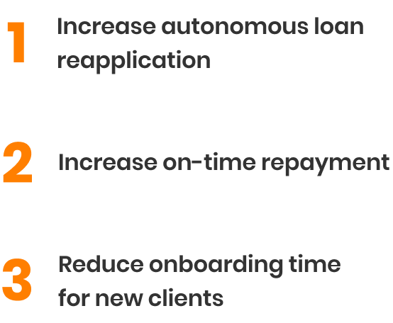
Increase in loan applications and repayments
But language was only one barrier to access: most of Muawin’s clients were novice technology users, and did not have the same mental models that make it easier for experienced users to adapt to an unfamiliar app.
So in addition to the translation, we worked on an expanded problem set that directly addressed the end goals:

How we did it
First, we read a lot of words
Secondary Research
We started by reviewing existing research on designing for low-literacy users.
With a tight timeline and a modest budget, we could not test all of our design choices, so we relied on what was already tested by others.
Of particular help was Indrani Medhi's Designing Mobile Interfaces for Novice and Low-Literacy Users, and Nithya Sambasivan's A Framework for Technology Design for Emerging Markets.
Then, we looked at existing apps
There are several apps that focus on small retailers and low-confidence users: Bazaar, Tajir, Retailo, Jugnu, Dastgyr, and Bykea, to name a few.
Since our users were already accustomed to many of these apps, we collected screenshots and used them as a reference for where to begin - for app interactions as well as Urdu translations.
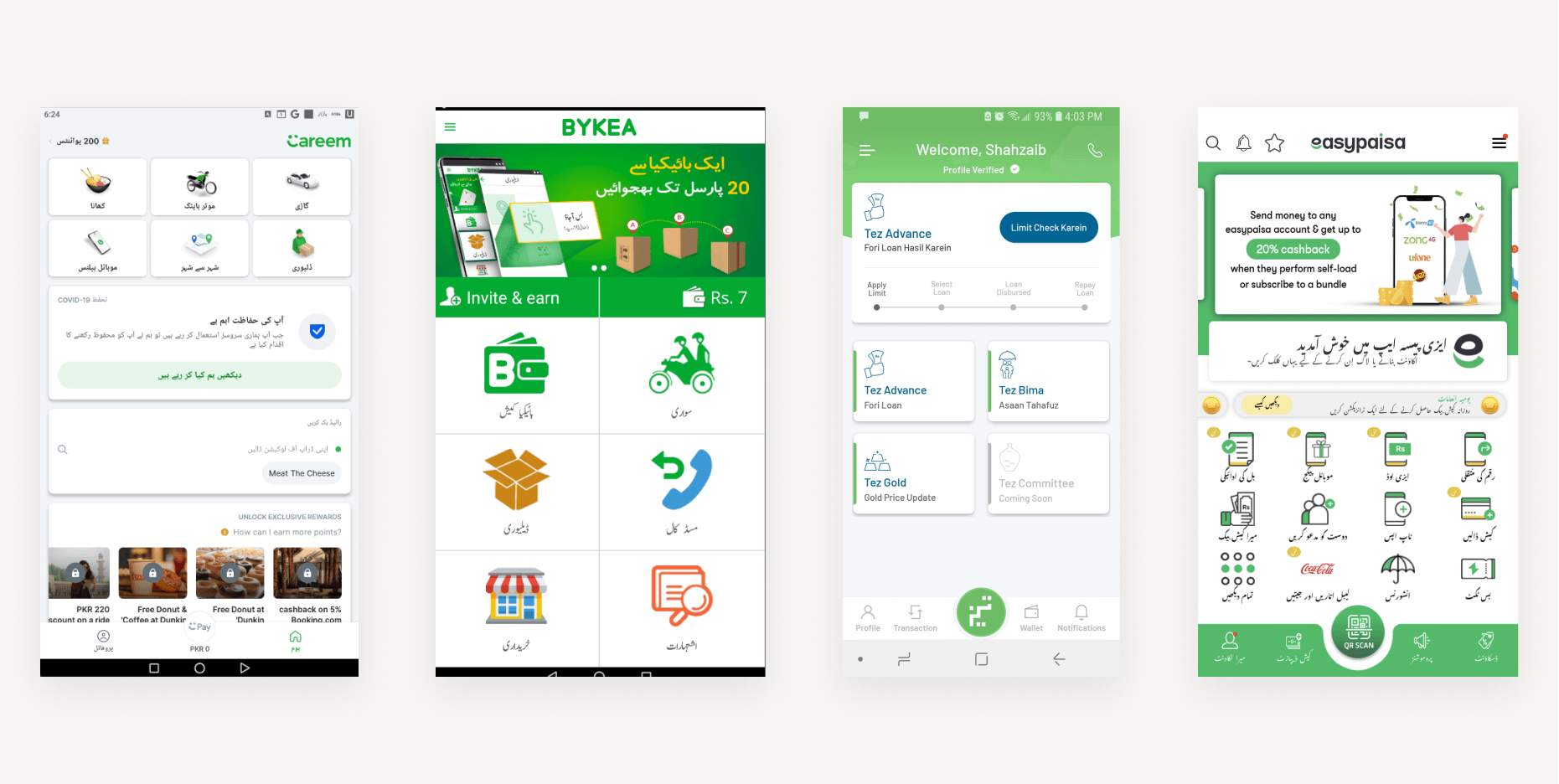
We collected screenshots from about a dozen Urdu-focused apps and put them all in a (very messy) Figma file for reference.
Into the field and far away
Exploratory interviews
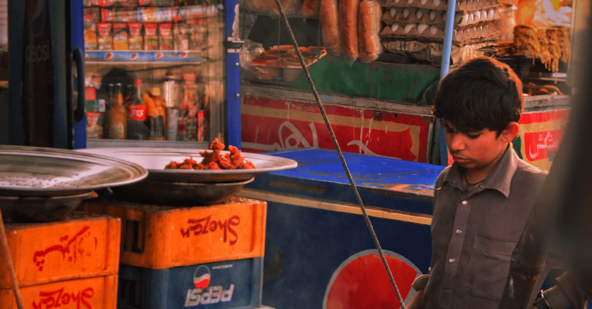
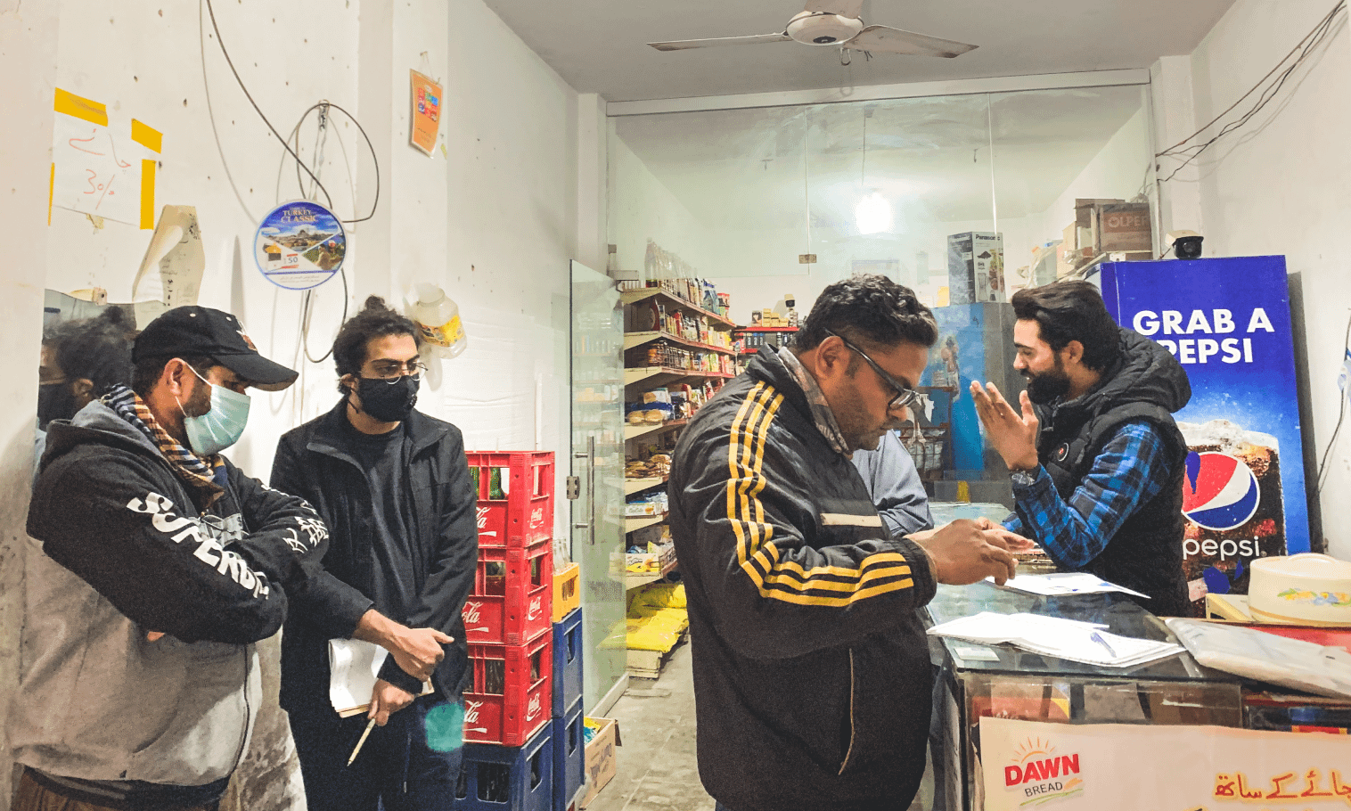
Armed with this base knowledge from secondary research, we then set out to observe Muawin users in their stores.
We wanted to understand not just their use of Muawin, but also their lifestyles and workflows, how they interacted with other technology, and how Muawin fit into all of this.
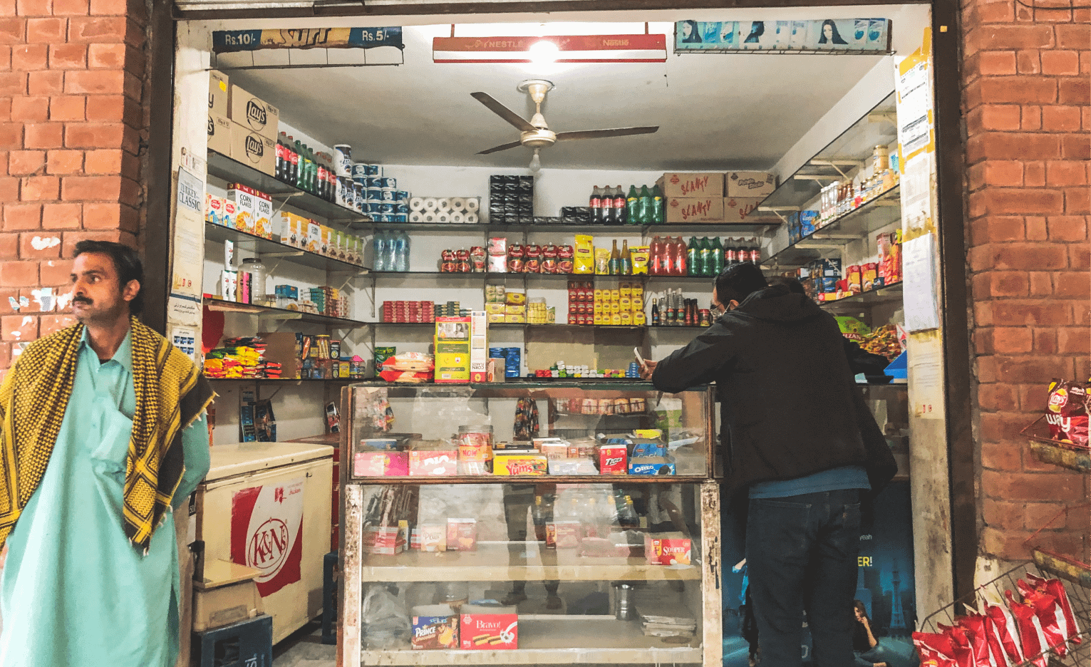
We also wanted to understand how the sales and onboarding process worked, so we took out a couple of days to shadow one of Muawin’s on-ground salesmen across three different prospective clients.
We saw how the salesman approached new customers, made his pitch, and in case of a successful pitch, how he onboarded them to the platform - and importantly, which parts of the app the clients needed help in understanding..
Mapping it all out
Journey Mapping
From these initial interviews and visits, we had enough information to make a customer journey map for what an ideal user flow would look like.
This also gave us a handy reference for what screens we needed to design for each step of the journey; and how we could achieve our initial goals through non-UI interventions as well.

One app, two users
From these trips, we realized that we were actually designing for not one, but two distinct users: the retailers and the salesmen.
The retailers needed to use the app to apply for loans and to pay them back.
The salesmen were using the same app to onboard retailers manually, since the retailers could not reasonably be expected to sign up on their own for a high-involvement financial product.
So to achieve a reduction in onboarding time, we needed to optimize the sign up process for the salesman and the rest of the app for the retailer.
And now, we start
With our ideas now rooted in solid research, we began with the actual manifestation of our design process.
Design. Test. Repeat.
Rapid prototyping and usability testing
It was clear that we wouldn’t be able to just put out one design and hope that it worked.
So we spent several rounds designing prototypes, testing them with users, addressing usability problems, and iterating on our prototypes again.

Usability testing proved particularly difficult with shopkeepers.
Since they were often the only ones minding their stores, we were frequently interrupted by customers that needed tending to; and there were also challenges with their availability.
Eventually we did manage to scrape together enough data to be confident in re-doing our designs.
How it turned out


For our final design, we focused on three key areas:
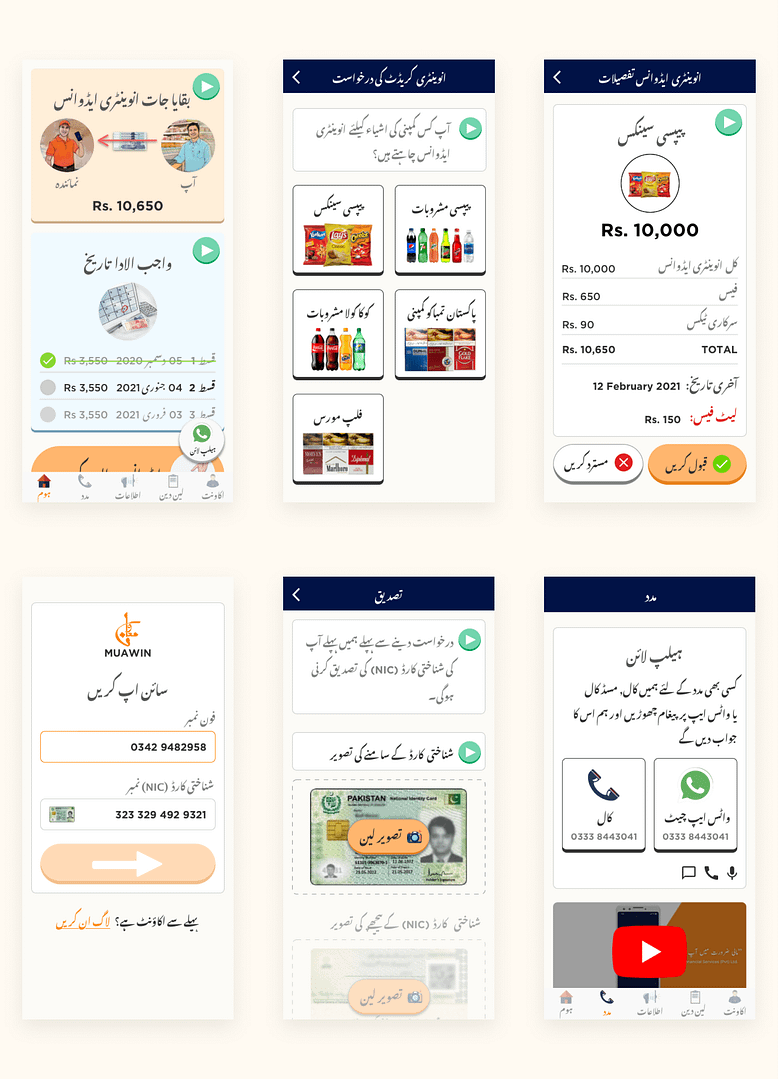
1. Discoverability
We noticed that for most of our users, the home screen was the only page that mattered.
They tended not to explore the app, and if something was buried under a sub-menu or a different tab, it may as well not have existed.
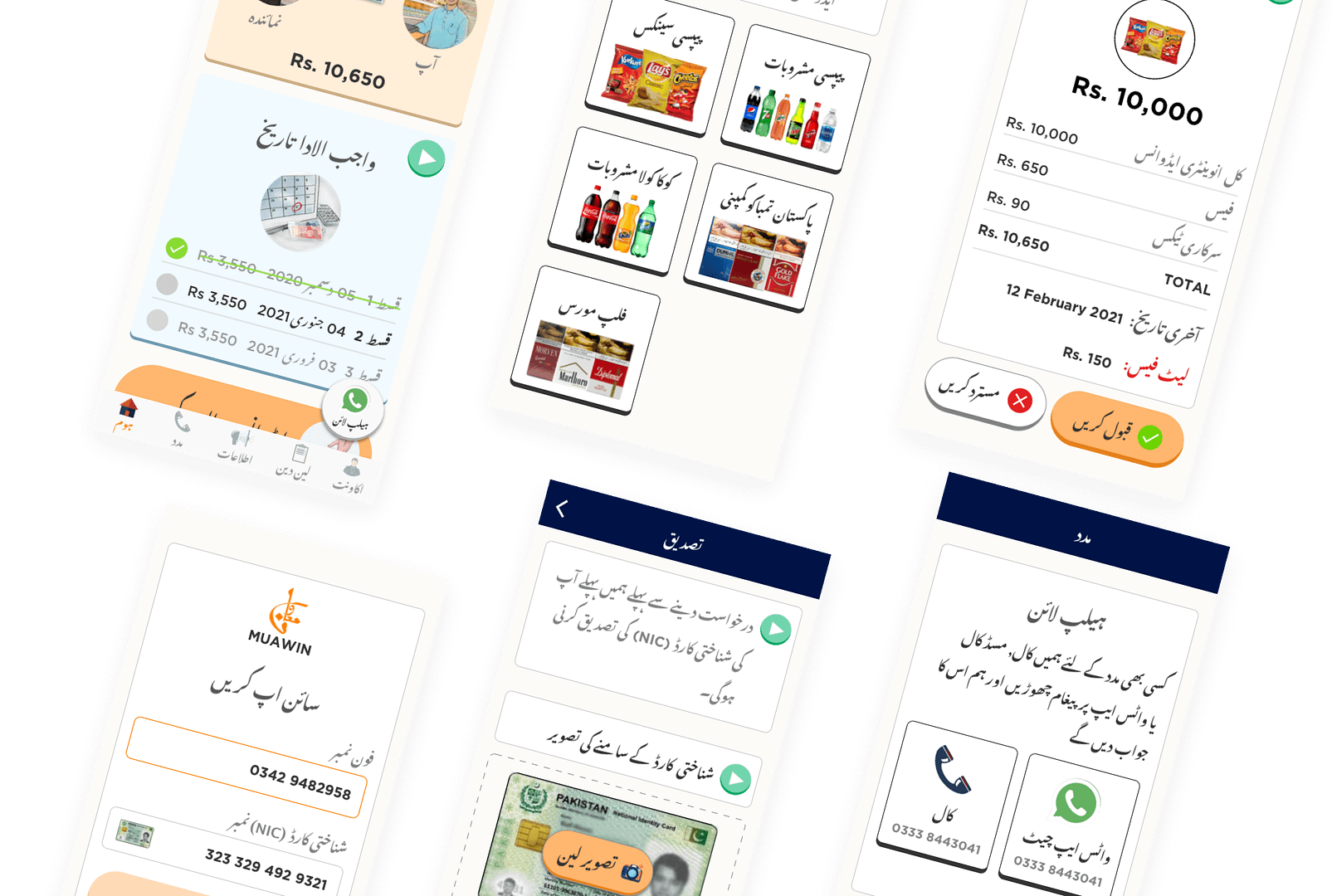
So we brought out key information about their loans and put it all on the home page.
This came at the expense of an information-dense screen, but we felt this was necessary - and even preferable - for our users, who did not seem to appreciate the minimalist style that many Western designs strive for.
2. Accessibility
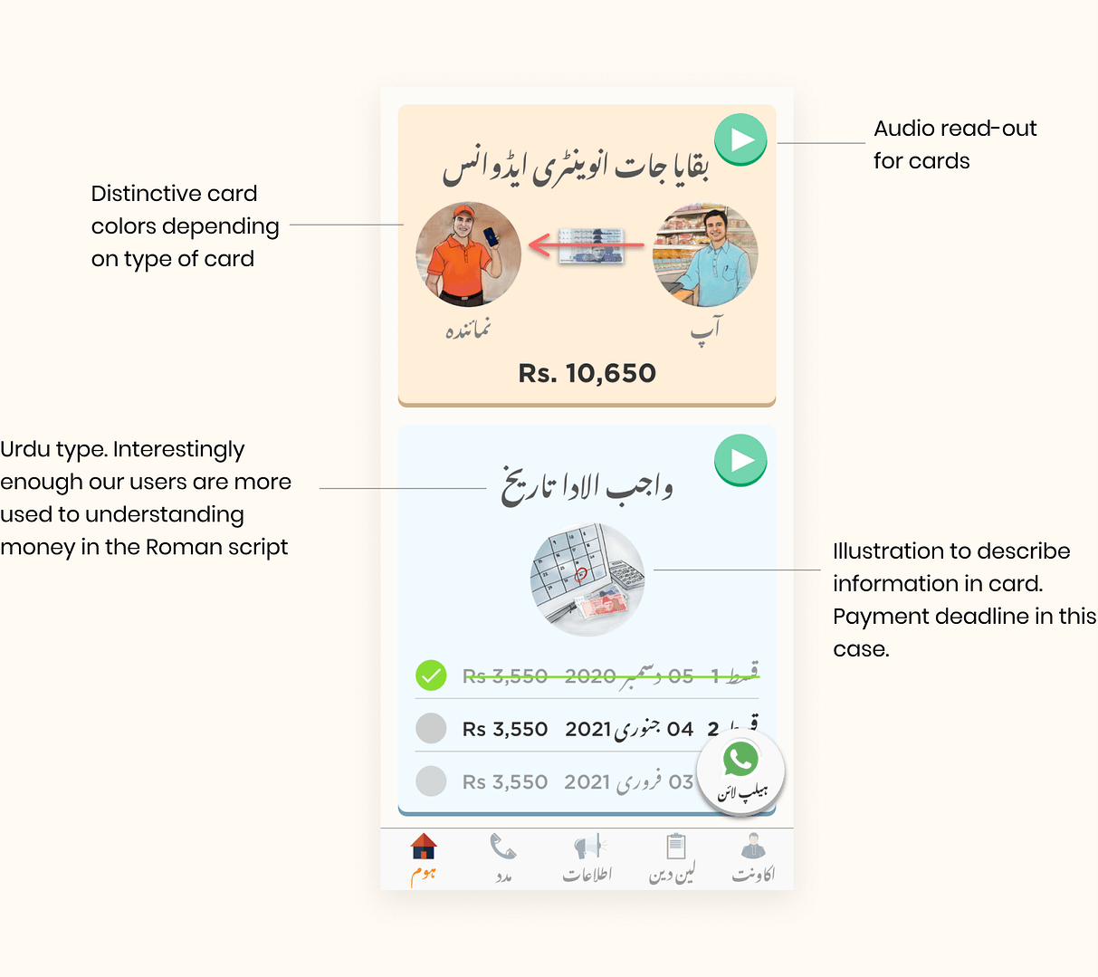
To design for low-literacy users, we used a four-pronged approach for understanding key information:
Translation:
Translating the app to make it accessible was the original goal, but we found it had additional benefits.
Muawin had to explain to prospective users how their loans were Shariah-compliant, and they seemed to trust the Urdu app more than the English version.
Color-coding: we used distinctly colored cards to aid memory and recall.
We had noticed in our tests that users often did not understand button labels or icons, but knew to press "the green button" or "the blue botton" for a specific action. So we used different colors for different types of information.
Audio read-outs: Some of our users could not read at all, so we added audio clips to narrate important on-screen information.
Many of these people regularly used WhatsApp via the voice notes feature, so we mimicked the style of the WhatsApp voice note playback icon to indicate audio narration.
Illustrations: we commissioned illustrations that depicted what action the user was going to take by pressing a certain button.
We considered using real-life photographs for this purpose, but our secondary research indicated that illustrations seem to work better than photos.
Here's a closer look:

From our research, we found that the illustrations should be detailed enough to provide as much context as possible.
For example, the shopkeeper has products behind him to indicate who this is supposed to be; and the Muawin salesman is wearing a distinctly-colored shirt and cap to indicate this is a company representative - cues that even those who can't read were able to pick up on.
3. Product expansion
During the course of our reearch, we found that some problems would not have a UI-based solution.
So we also advised Muawin on product development for alternative modes of interaction with their service.
SMS reminders
Many retailers tended to conserve their limited mobile data, or turn off Wifi.
Some had removed the Muawin app if their phones were low on storage (or were hoping that deleting the app would also wipe away their loan).
Instead of relying on the app or its push notifications, we recommended including SMS reminders, as they do not require an internet connection, and have a higher opening rate.
USSD Services
Some users did not own smartphones at all. For those with feature phones, we recommended implementing USSD services.
This allows users to achieve basic tasks and retrieve information on any phone, without needing an internet connection.
We saw that many were already using USSD codes to use services like JazzCash and EasyPaisa for their payments, so convincing them to adopt this for Muawin would be relatively straightforward.

Did it work?
Yes and no.
At the time of writing, the redesigned app has just been launched, so data is limited; but early feedback seems promising.
The Urdu app is immediately more useful and usable for a larger proportion of retailers. They are better able to understand what they owe, and when.
And based on qualitative feedback, salesmen appreciate the time saved in their onboarding workflow, since it allows them to sign up more customers in a given shift.
However, we are still some way off fully autonomous use of the app to apply for loans.
We don't want to over-state the role of design in what is a complex problem space with a high-involvement financial product. But with this initial redesign, we think the groundwork has been laid for additional improvements over time to work towards the goal of full autonomy.
And finally…
Here's a bunch of resources we used in our design process. Bookmark it!
And here's a more elaborate article on the issues we faced when designing in Urdu.
Check out our feature for Muawin on DesignRush for Best App Design!
Working on something similar and need to bounce off ideas?
Get in touch! We'll have lots to talk about.


Want to work together?
Quick links
Want to work together?