Sabaq
Designing a better learning experience for children
Expertise
Research, Design & Interaction
Deliverables
UX, UI, Prototypes, Design System
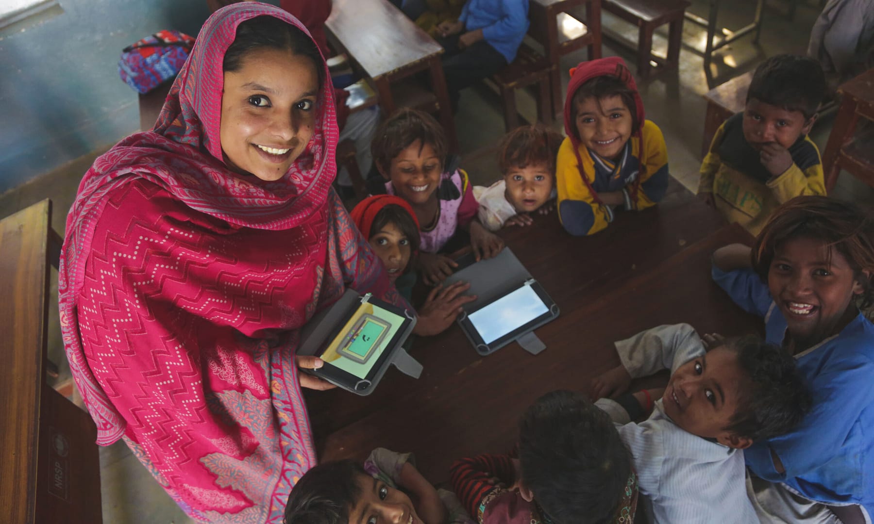
SABAQ is an educational technology company that makes applications, content and tools to aid learning.
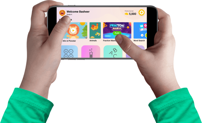
We worked on MUSE - their flagship Android application designed for use both in and outside the classroom. MUSE has a digital library of 1000+ lessons, interactive exercises and games being used in over 1800 schools across Pakistan.
What we did
We worked with the core team to use existing feedback and user data to improve the experience of the app.
This included:
New home page
UI refresh & design system
New sign-up and login flow
A new homepage
Using app analytics, we found that a majority of users were dropping off without consuming any of the content.
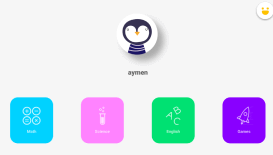
We realized that there were 3 interaction points where a user had to make a decision before they got to the first piece of content:
Choosing subject
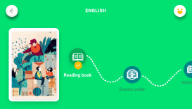
Choosing topic
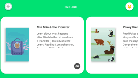
Choosing the content
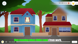
Actual content

Choosing subject

Choosing topic

Choosing the content

Actual content
There was simply too much friction before a user actually got to see the value of the app.
In order to streamline the first-launch experience, and aid content discovery, we worked on two key interactions:
Changing 3 interaction points to one, so the user was only one touch away from accessing their first piece of content
Surfacing our best content on the homepage via a browse section
UI Refresh
With no design system or proper guidelines the current app had become inconsistent with how font-sizes, shadows, margins, padding, and color schemes were used.
SABAQ also wanted a rebrand of the app, so we worked on building a design system that would bring consistency across the product.
Here's the old app.
The highly saturated colors make it difficult for the content to stand out.
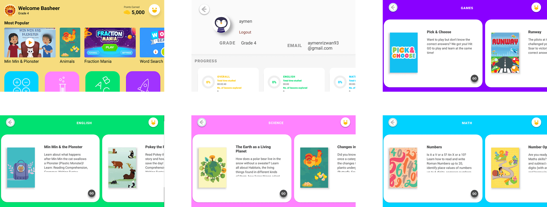
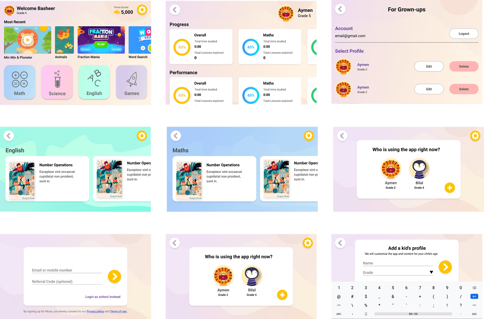
And here's the new app.
We still wanted the product to have a playful feel to it, so we retained the colorful aesthetic while moving towards more pastel shades.


Simpler sign-up flow
We also addressed a number of usability issues, including with the sign-up flow.
Here's the old sign-up process:
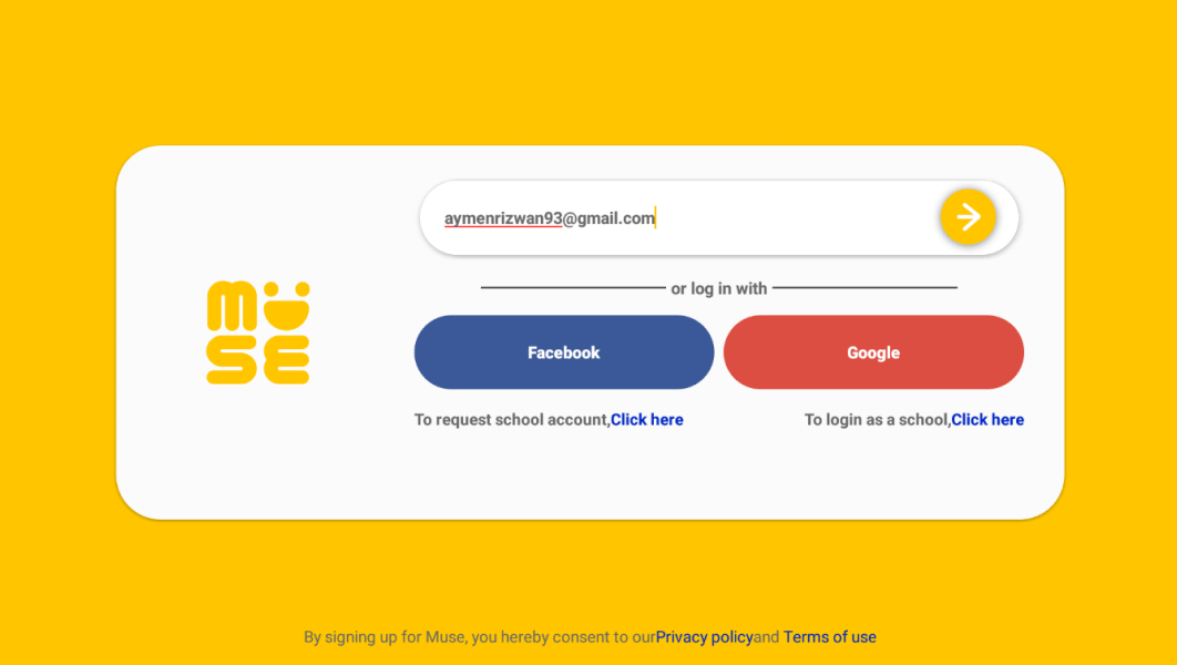
We removed social media logins because of app store age restrictions
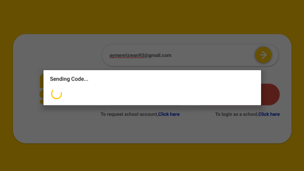
The loader kept spinning while the code was being sent which made users think the app had frozen
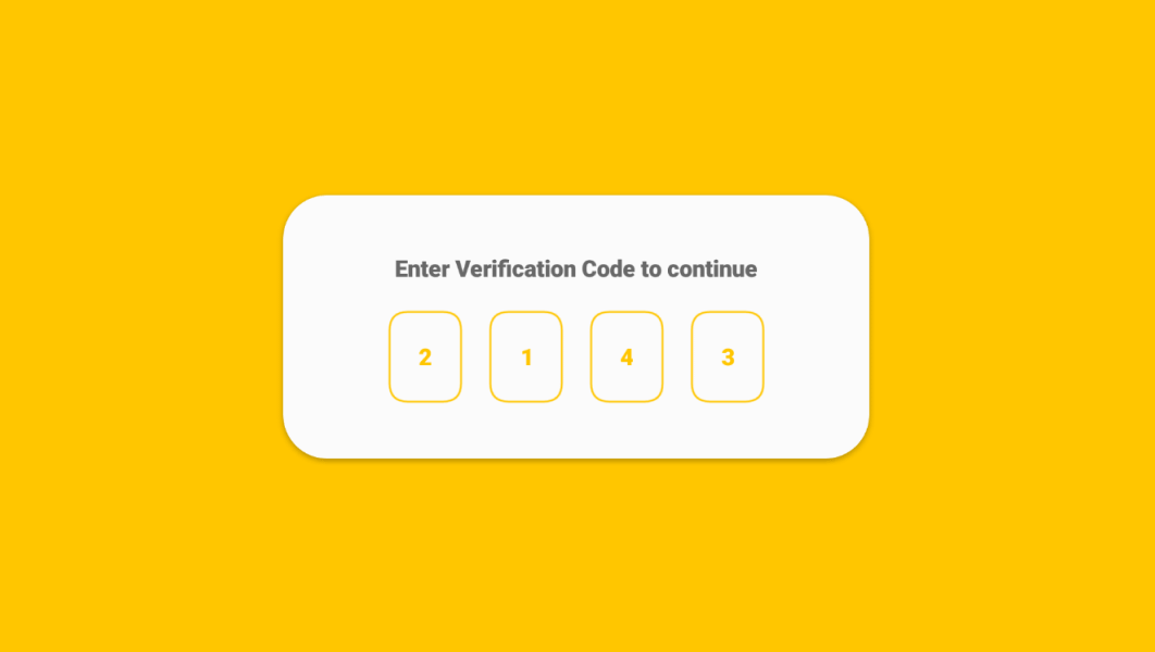
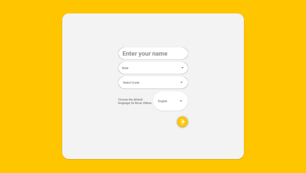
There were unnecesary fields in the form that weren’t required
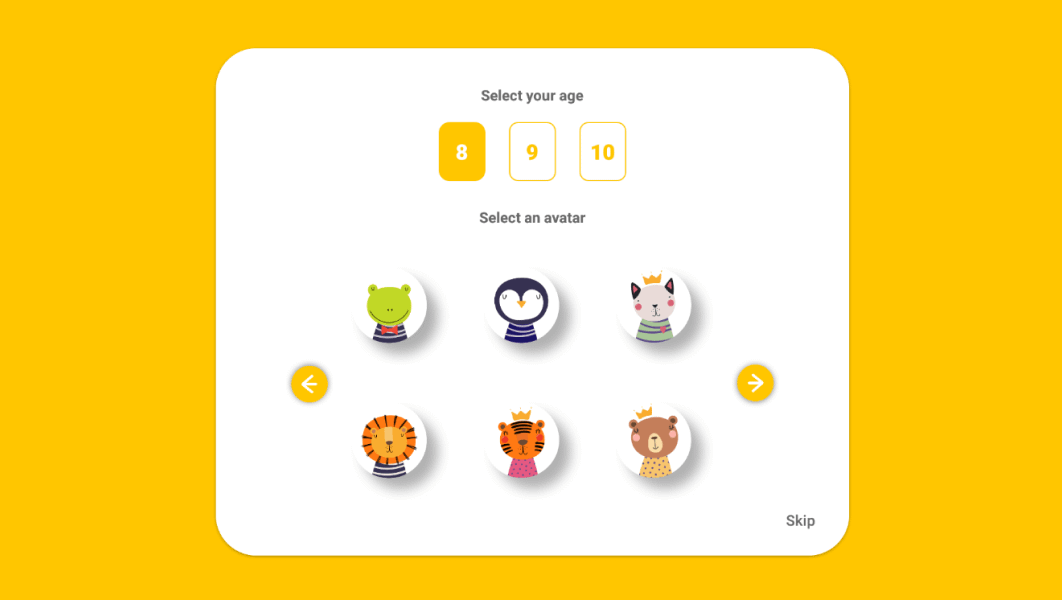
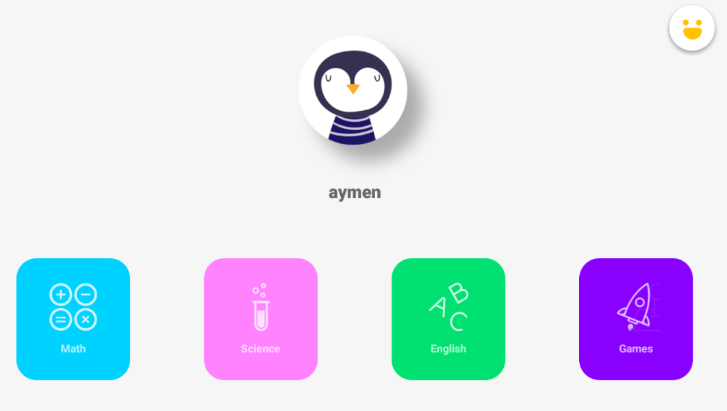
Parents had to create seperate accounts with different emails for each child that was using the app and then log in and out
And here's the new, simpler sign-up process:
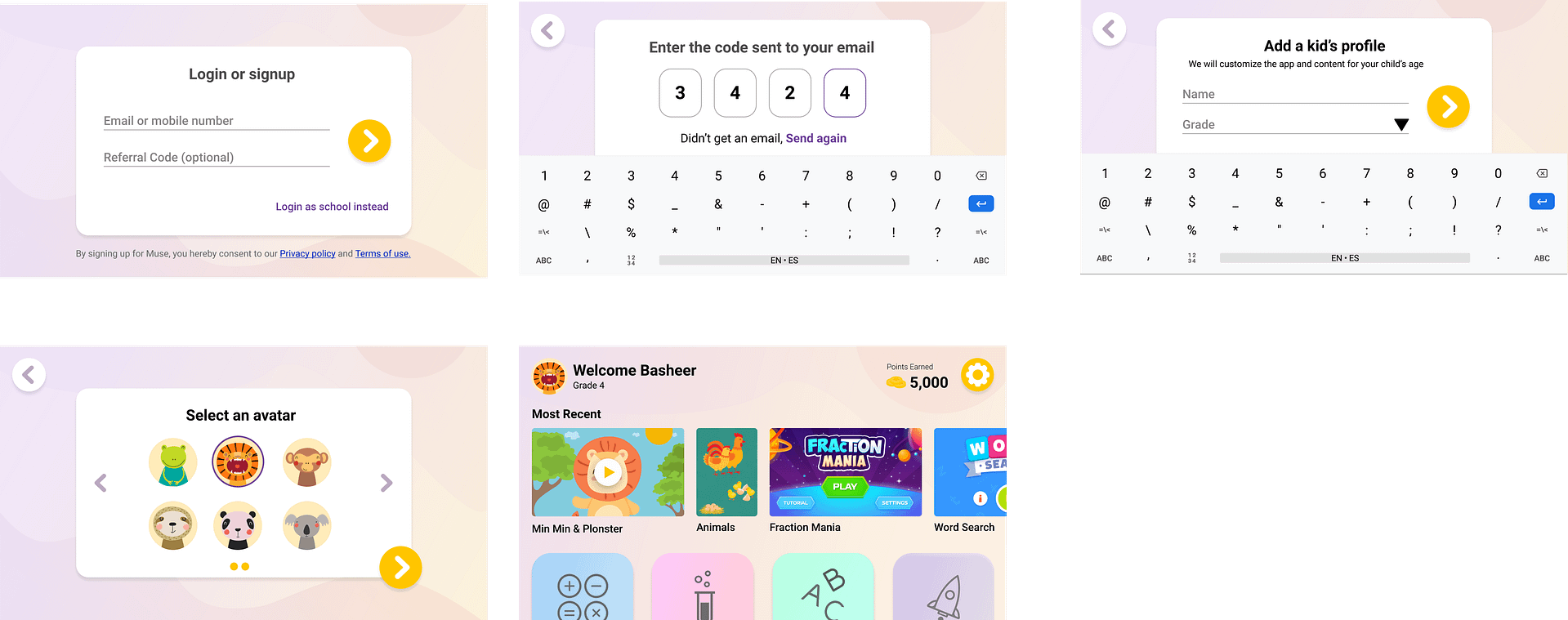
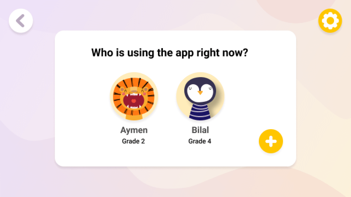
We also added support for multiple profiles so parents didn't have to create multiple accounts and constantly log in and out of them:
Want to work together?
Quick links
Want to work together?

